
Bookkeeping Infographic
I thought the article I wrote on how to pick a bookkeeping service came out really well, but it was over 3,500 words. Not everyone is that excited about bookkeeping (not sure why not? 🙂 ) so this seemed like a good opportunity to try creating an infographic. Here are the results:
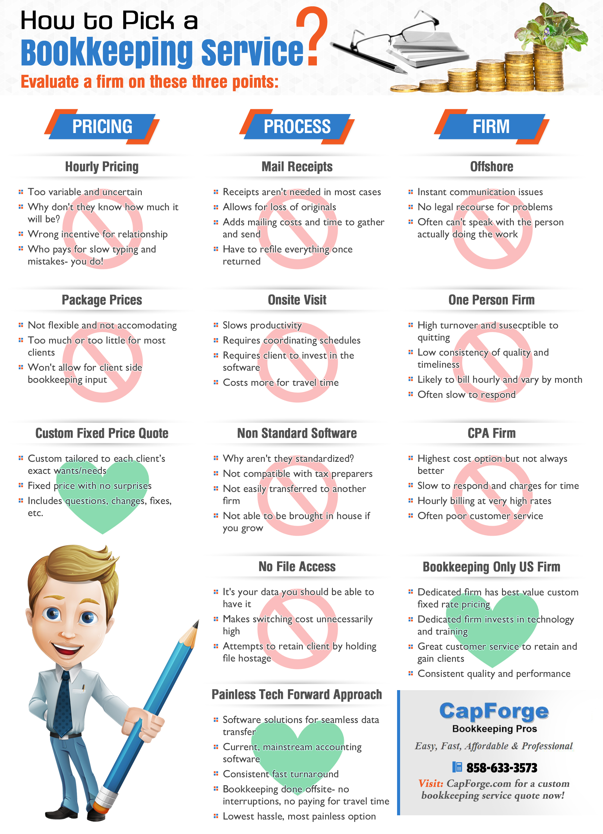
Although the bullet point text is a bit small, the main points are certainly clear the red crossed out circle vs the green hearts make the point pretty well as to what is good and what isn’t (hopefully!). And anyone who really wants to read it can of course access the full size image just by clicking on it.
The idea of course is to make something people want to share or post on their own sites to get some link love as well as some traffic back while of course providing actual value that makes it worth posting in the first place.
Would you like to post this on your site? We would certainly appreciate it! Here is the embed code:
<p><strong>Please include attribution to CapForge.com with this graphic.</strong><br /><br /><a href='https://capforge.com/bookkeeping-infographic/'><img src='https://capforge.com/wp-content/uploads/2015/06/How_to_Pick_a_Bookkeeping_Service.jpg' alt='How to Pick a Bookkeeping Service' width='540px' border='0' /></a></p>


