Creating a Killer Call to Action for Your Website
So you’ve optimized your website for SEO, and your landing page is clear and concise. What’s the next step to effectively hook your site visitors? Creating a killer call to action (CTA). Your CTA is a crucial part of your marketing campaign that encourages people to sign up for an email list, subscribe to your services, and more.
Having a call to action button is one thing, but creating an effective CTA requires planning and execution. This article will discuss how you can create a call to action button that motivates your site visitors to take the action you want them to do.
Why is a call to action important?
Every landing page needs a call to action to fulfill its purpose. Why? Because a well-crafted CTA gets you one step closer to transforming site visitors into clients or customers. Around 90% of your site visitors read your CTA, and you want to make the most out of that initial impression. You’ve done all the work to create a convincing advertisement. The last thing you want is for customers to get lost on your landing page without knowing the next steps to take.
Your call to action helps steer your leads in the right direction and ultimately lead them to the path of conversion. Without a CTA, your advertising efforts will go to waste, and your bounce rates will increase.
What are the components of a good call to action?
The call to action button is more than just a string of well-thought-out words. It’s a combination of various elements that help trigger a response from your site visitors. When creating a compelling CTA, you need to consider the following:
- Color: A good call to action button stands out immediately from a webpage. You want your CTA button to have contrasting colors so that it separates itself from the page’s design. Colors like red, yellow, orange, and green are perfect for CTA buttons as they are vibrant and noticeable.
- Design: The design of your call to action is just as important as its color. Everything from the font, button size, and design elements greatly impact your CTA’s effectiveness. When designing a CTA, keep it subtle but impactful by blending the right color and size. You can also experiment with animations to create an attention-grabbing CTA.
- Placement: The placement of your CTA will determine its success in encouraging customers to take action. Ideally, your call to action should appear on the top portion of the web page or in the middle. By doing so, site visitors will be able to see your CTA without scrolling down.
- Text: To trigger a response from your site visitors, you have to convince them through your copy. A call to action button needs a strong command verb so that users will take action. Keep your copy short and sweet to get your point across.
By combining all these elements, you can craft a compelling CTA to have users take action and boost your conversion rates.
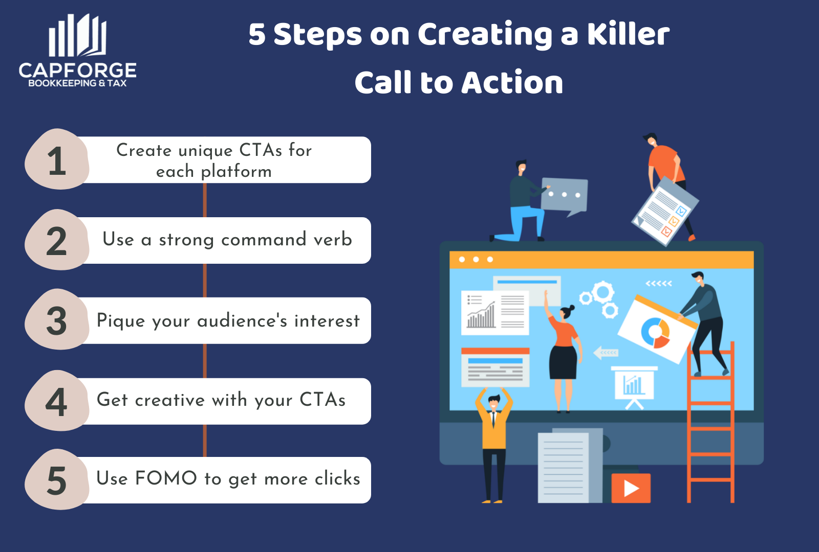
5 steps on creating a killer call to action
Crafting a high-converting call to action can prove challenging to most marketers. But when armed with the right information, you’ll be able to convince your audience to do something without sounding too assertive. Here are the five steps you need to follow:

1. Create unique CTAs for each platform
Most marketers think that creating a call to action applies to all platforms, whether you use it on your website or social media. But that’s not the most effective way of creating a CTA, as people interact differently with your website and your social media page.
When crafting a CTA for your website, you want to keep it brief yet comprehensive. A good example is “click to join now!” or “get started today!”. But, on your social media page, a CTA with a short phrase may lose its effectiveness because it tends to get lost in a sea of words.
To address this, you need to write a lengthier call to action to place more emphasis on your CTA. Phrases like “join now and get 10% off on your first purchase!” or “start your membership today and receive a 15% discount!” will work best when crafting a CTA on social media platforms.
By varying your CTA phrases, you can maximize its effectiveness throughout different platforms.
2. Use a strong command verb for your call to action
An impactful CTA contains a strong command verb that lets people know which action they should take. After all, you only have a few seconds to tell your site visitors what to do. Forget about writing elaborate copy and focus on being as straightforward as possible.
Let’s take a look at these two examples:
- Sign up now for a free trial!
- A good offer is waiting once you click!
The first example tells the user exactly what to do and what they’ll get after taking action. The command verb prompts an immediate response, thus making the CTA more effective. The second example fails to accomplish this as the verb’s positioning isn’t ideal. If the user doesn’t end up reading the whole CTA, it may not elicit the action you want.
3. Pique your audience’s interest
When creating a killer call to action, you must stimulate your site visitors’ minds. You want them to be curious about your offerings and prompt them to take action. For example, if you’re writing a CTA on your social media page, you can use a phrase like “Click on the link to learn how a couple earns a 6-figure income at home!”
After clicking your call to action, it’s about getting people hooked on the possible outcome. Say you’re offering a free ebook when a user subscribes to your email list. What value will they receive upon subscribing Ultimately, you can convince your target audience to click on your CTA by painting a clear image of the result.
4. Get creative with your call to action
While there are certain elements to keep in mind when crafting a call to action, there are no definitive rules to follow. If all you do is create the same CTA with little to no variations, you’ll severely limit its conversion ability. That’s why you need to be creative with your call to action buttons to not only break the monotony but also distinguish yourself from your competitors.
For one, you can get creative with the language you use in your CTAs. Instead of the common command verbs like “subscribe now!” or “sign up today!”, you can spice things up with “inhale, exhale, subscribe.” The phrase starts with a transitive verb and ends with a command verb. The unique language keeps your CTA interesting and allows it to stand out from the other contents of your web page.
Using compelling visuals also directs the reader’s attention to your call to action. You don’t have to go overboard with the graphics; you just need subtle cues to point readers toward your CTA. You can use arrows to emphasize your CTA button or a character that holds the button. Let your creative juices flow, and borrow inspiration from other brands that implement a unique call to action.
5. Use FOMO to get more CTA clicks
If you haven’t heard of FOMO, don’t worry. FOMO means fear of missing out, and it’s an excellent motivator for getting people to respond to your call to action. People are more likely to take action when they see a limited-time deal. Knowing that they might lose out on a huge sale is often enough to trigger a response.
A good example of using FOMO to get more CTA clicks is a phrase like “Buy now! Sale ends in 24 hours”. Anytime you mention a sale or promotion in your call to action, you create a sense of urgency that encourages people to grab the offer. Fashion brands deploy a FOMO tactic with limited releases to secure as many sales as possible.
In summary
A lot goes into creating a killer call to action than most people realize. You have to consider the copy itself, the design of the CTA, the placement, and the phrases you use to maximize its effectiveness. While crafting a call to action is a resource-intensive task, it’s well worth it when you see your conversion rates increase.
Your best approach is to try out different CTAs and run an A/B test to determine their effectiveness. With enough trial and error, you’ll be able to craft a high-converting CTA that gets your site visitors to take action.
Monitoring the financial health of your business is crucial for maintaining profitability. For expert bookkeeping services, our team is ready to assist you. Simply fill out the form below, and we’ll get back to you as soon as possible.


