How to Reduce Bounce Rate With These 8 Tips
Many brands compete for visibility online because engagement puts you in the best position to succeed. But what happens when you generate traffic and your site visitors leave without interacting? You get poor conversions, and your bounce rate increases.
A high bounce rate indicates there’s something wrong with your site. Perhaps your call-to-action isn’t clear, or your website’s design is clunky and unresponsive. Whatever the case may be, you want to address it as soon as possible to ensure a positive user experience.
This article will discuss how you can reduce your bounce rate to boost your conversions and improve customer satisfaction.
What is bounce rate?
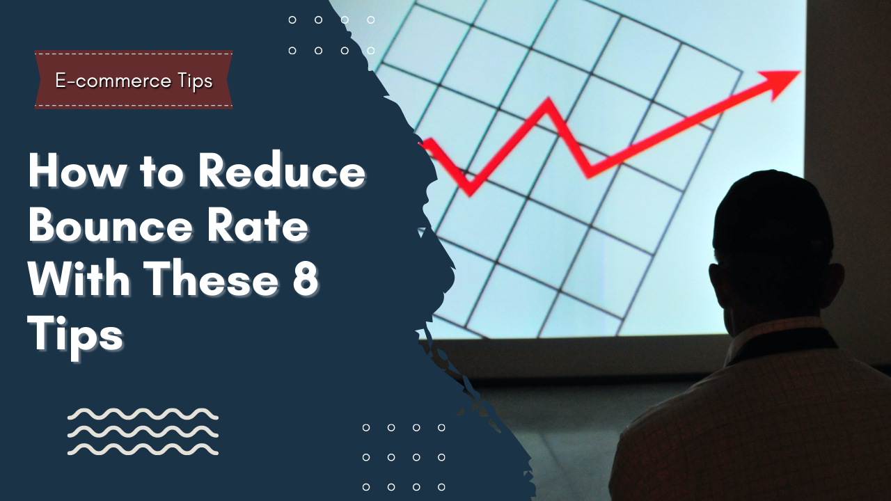
Simply put, bounce rate refers to the number of customers that leave your site after visiting only one page. Most experts agree that a bounce rate of 50% or below is good enough for most brands, meaning more than half of your customers navigate to other pages of your website.
You want to keep your bounce rate low to ensure customers are clicking on your pages and navigating your website. Remember, your website is your brand’s face on the internet, and if people have a tough time navigating your site, there’s a good chance they may resort to other options.
You may think it’s normal for users to leave a website. But if you spend most of your resources crafting CTAs, landing pages, and a compelling UI, your goal should be to maximize the traffic you generate. Otherwise, you’ll end up losing sales and money simultaneously.
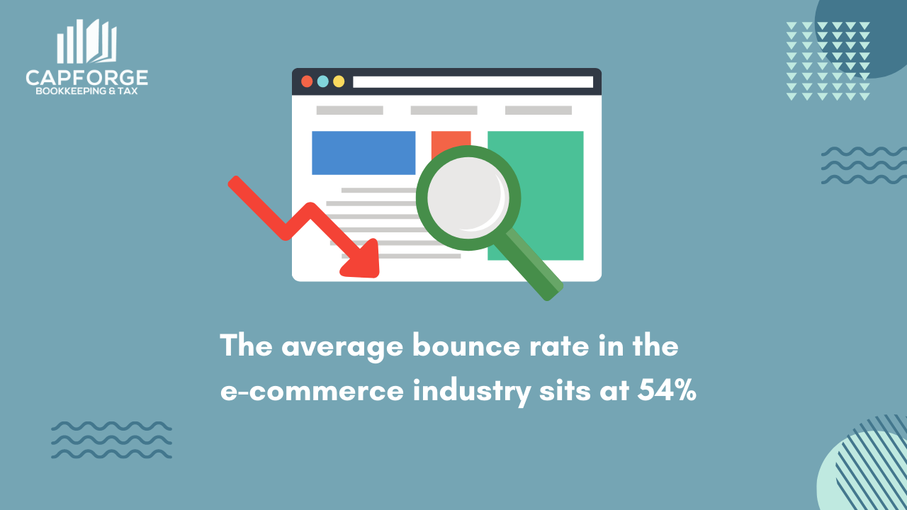
Steps on reducing your bounce rate
Now that you know what bounce rate is let’s discuss how to minimize those numbers and maximize your conversions. These ten tips will do wonders for your website and help shape the user experience more positively.
1. Be mindful of where you place your CTAs
You only have a couple of seconds to make a solid impression when people visit your site. You want to ensure your call-to-action is visible when they arrive at your web page during these moments. We previously discussed how to craft killer CTAs, and one of the main components of a good call-to-action is its placement.
A good rule of thumb is to place your CTA at a prominent spot on the webpage without the need for the user to scroll down. You can place your call-to-action in the middle of the page, on the top left, or at the center-right. Couple that with concise copy and contrasting colors, and users are more likely to click on your CTA and take action.
2. Focus on the user experience
Place yourself in your customer’s shoes for a moment and envision yourself shopping on your brand’s website. How do you find the overall experience? Is it easy to find the products you’re looking for? Or is it frustrating to constantly navigate from one page to another? The whole user experience of your website will dictate how site visitors perceive your brand, so make sure you nail this down pat.
A good website should have a clean user interface, smart page layouts, and consistency between pages. These elements help shape a positive experience for the user by allowing them to navigate your website quickly. The easier it is for customers to find what they’re looking for, the more satisfied they’ll be when checking out your site.
3. Improve your website’s speed
Nothing frustrates users more quickly than a website that loads slowly. Blank scripts that load for more than 3-4 seconds are usually enough for users to bounce out of your site and look for other alternatives. To avoid these scenarios, you need to improve your website’s speed to cater to the demands of your site visitors.
Google Pagespeed Insights and Pingdom are two excellent tools that will help identify speed issues in your website and how to fix them. Make sure you compress your images, so pages load faster and optimize your site for desktop and mobile devices.
4. Conduct A/B testing
Whenever you make significant changes to your website, it’s always good to conduct an A/B test to know whether the new variation works. For example, say you want to create a new CTA because your conversions are dropping. You want to take the control variation (the old CTA) and compare it against the new variation to see how the latter performs.
We’ve written an in-depth guide on A/B testing, highlighting the importance of the test and how you can conduct it. When you finally discover a new variation that works for your website, stick to it and watch how it affects your bounce rate. You can make small adjustments until you find the sweet spot for your website.
5. Establish your brand’s credibility
Consumers are a savvy bunch, and they’re mindful of the brands they interact with before purchasing. When they feel a brand doesn’t meet their expectations, they won’t hesitate to leave your website quickly. That’s why it’s important to establish your brand’s credibility so that people can trust the products/services that you offer.
One way to establish brand credibility is through social proof. Think testimonials, reviews, trust badges, and social media comments. These elements prove that people have positive interactions with your brand, influencing your site visitors to make an informed buying decision.
6. Craft compelling landing pages
When it comes to high bounce rates, a poorly designed landing page is often the main culprit. Your landing page is what directs leads to your products/services. If people don’t find your landing page valuable or interesting, they’ll immediately bounce out without second thought.
Crafting compelling landing pages requires thorough planning and consideration. For one, the headline should make a strong statement that capture’s the reader’s attention. After that, your copy should communicate exactly what the landing page is about.
A good landing page highlights the value of the product/service, thus prompting them to click your CTA. Here’s a deep dive on creating a landing page that converts to help reduce your bounce rate and secure more sales.
7. Use rich images to capture user attention
Here at Capforge, we love using images to keep readers interested. Adding visuals to your pages helps site visitors process information faster and helps break up long walls of text. Google is known for keeping its web pages pretty simple, but even they are now using high-quality images to capture user attention.
You can find plenty of royalty-free images online and use them as a background for your web pages. If you want to dabble with your creative side, websites like Canva are a good place to start creating custom images for your web pages.
Adding interactive images next to your call to action is also a good strategy, as it gives users a visual clue on what to do next after arriving at your landing page. Remember always to compress your images to ensure faster loading speeds.
8. Format your texts
Speaking of long walls of text, you want to formate your copay so that users will find your web pages more readable. By breaking your copy into headers and subheaders, people can process the information faster and identify the main highlights of your page. Aim to keep your paragraphs below five sentences and use bulleted lists to draw attention to specific items.
Making your content more accessible is a quick and easy way to reduce bounce rates because people won’t need to spend a couple of minutes finding what they need. Format your copy accordingly to improve your conversions.
Conclusion
Bounce rate is a crucial figure that every brand must analyze to ensure its website performs to its full potential. High bounce rates mean your customers aren’t satisfied with how things work, so switch things up and do a proper A/B test to make meaningful changes. Hopefully, these tips will give you a better insight into how to reduce your bounce rates and improve your conversion rates.
With enough effort and testing, you can create a positive experience for your customers and keep them interested in your brand’s offerings.
Effectively managing your finances is key to sustained profits. If you need any help with expert bookkeeping services, our team is here to help. Feel free to fill out the form below, and our team will get in touch with you shortly.
